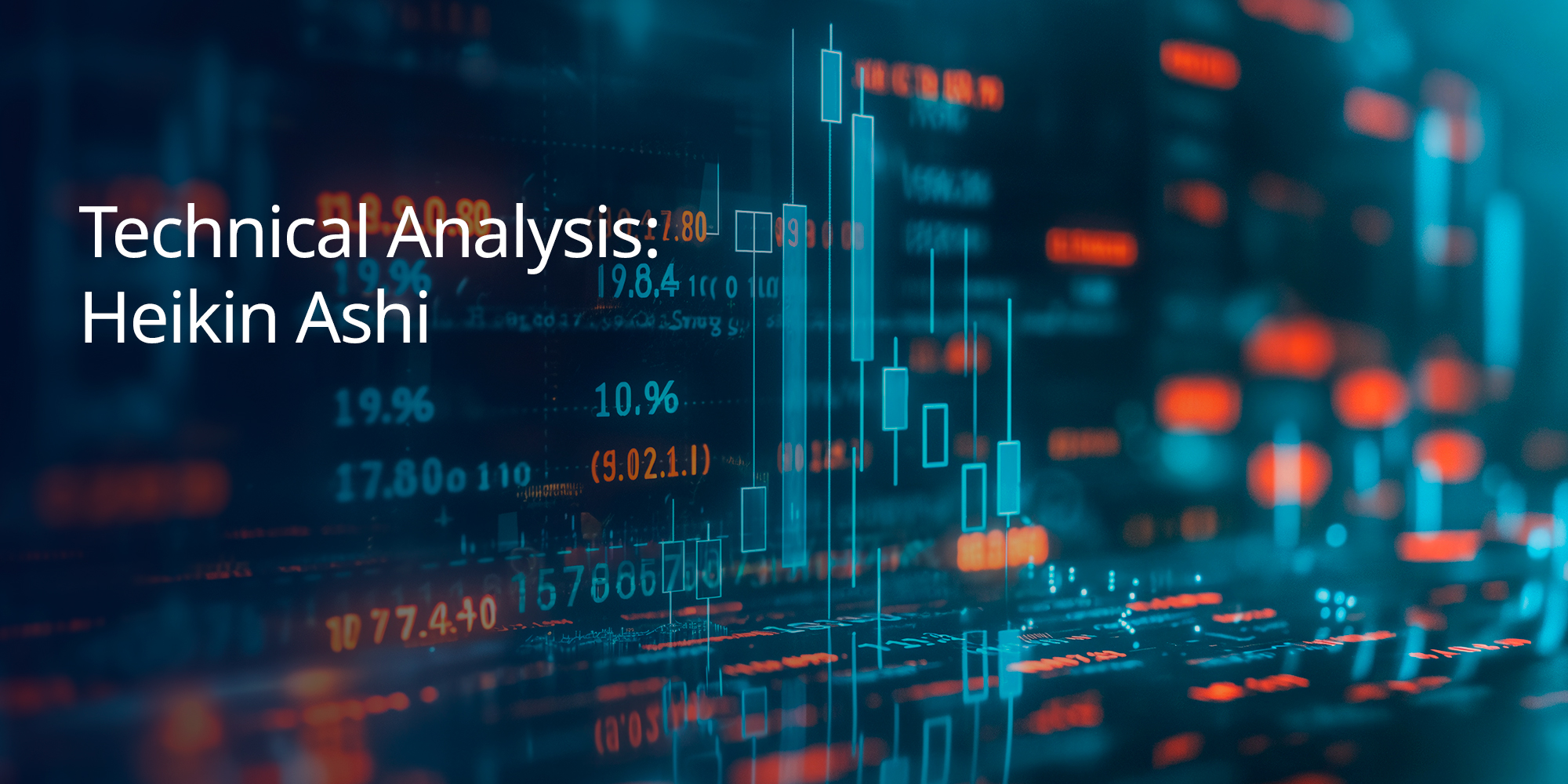

Technical Analysis: Heikin Ashi – Definition, How it Works, Types, Calculation, and Trading
When it comes to spotting trends and making confident trading decisions, chart clarity is key. That’s where Heikin Ashi comes in. Developed by Japanese traders centuries ago, this charting method filters out market noise by using averaged price data, helping traders focus on the bigger picture. Whether you’re a swing trader looking to ride trends or simply want a cleaner visual of market momentum, Heikin Ashi charts offer a smoother, more consistent view of price action. In this guide, we’ll explore how they work, how to read them, and how to use them effectively in your trading strategy.
What is Heikin Ashi?
Heikin Ashi is a refined version of the classic Japanese candlestick chart, designed to offer a clearer perspective on market trends by smoothing out price volatility. Developed by 18th-century Japanese rice merchant Munehisa Homma—widely regarded as the father of candlestick charting—this method takes its name from the Japanese term for “average bar.”
Unlike traditional candles, Heikin Ashi uses recalculated Open, High, Low, and Close (OHLC) values to reduce market noise. The Open is based on the midpoint of the previous candle, while the Close is the average of the current candle’s open, high, low, and close. The High and Low values are drawn from the highest and lowest points among the current period’s Open, Close, and High/Low, offering a more stable visual of price movements.
How Does Heikin Ashi Work?
Rather than reflecting raw price data, Heikin Ashi modifies the OHLC structure to present smoother, trend-based visuals.
Here’s how each value is calculated:
- Open: Midpoint of the previous bar’s Open and Close.
- Close: Average of the current period’s OHLC.
- High: Highest value from current High, Open, or Close.
- Low: Lowest value from current Low, Open, or Close.
This method filters out short-term noise, allowing for easier interpretation of broader trends. In bullish phases, you’ll typically see consecutive green candles with small or no lower shadows, indicating strong upward momentum. During bearish phases, red candles appear with little to no upper shadows, highlighting continuous downward pressure.
What Does Heikin Ashi Chart Indicate?
Heikin Ashi charts make it simpler to spot the overall direction of a trend.
- Green candles suggest a continuing uptrend.
- Red candles point toward a sustained downtrend.
Shadows or lack thereof add insight into momentum—lower shadows in green candles signal strong buying interest, while missing upper shadows in red ones confirm persistent selling.
Because it eliminates minor fluctuations, Heikin Ashi helps traders focus on trend consistency. This makes the chart a powerful tool for reducing uncertainty, aiding in clearer entry and exit decisions.
What is the Heikin Ashi Trading System?
Heikin Ashi fits a range of trading styles.
Swing traders appreciate the clean visuals and ability to follow longer-term price movement.
Scalpers also benefit, using Heikin Ashi to quickly assess intraday trends and momentum.
By providing a simplified view of price action, Heikin Ashi allows for quicker decisions without being overwhelmed by every minor price shift, especially useful in volatile markets.
How Can You Use Heikin Ashi in MT4?
Heikin Ashi charts can be easily added to MetaTrader 4 (MT4), one of the most popular platforms among retail traders. However, the indicator isn’t built-in by default, so you’ll need to install it manually.
Installation Steps:
- Open MT4 and go to “File > Open Data Folder.”
- Navigate to MQL4 > Indicators.
- Drop the Heikin Ashi indicator file into this folder.
- Restart MT4.
Applying the Indicator:
- In the MT4 platform, open the “Navigator” panel.
- Expand the “Custom Indicators” section.
- Drag Heikin Ashi onto your chosen chart.
- Adjust settings as needed and click OK.
Once active, the chart will show consistent green bars for bullish trends and red bars for bearish trends. This clear colour-coding helps traders track momentum and make well-timed trade decisions with ease.
What are the Advantages of the Heikin Ashi Chart?
Heikin Ashi charts offer a range of benefits, particularly for traders looking for a clearer picture of market trends.
One of the biggest strengths lies in how Heikin Ashi smooths out price fluctuations. By averaging out the data, these charts help eliminate market noise, making trends more visible and easier to interpret.
Trend recognition becomes more intuitive. A steady stream of green candles usually signals an uptrend, while consecutive red candles point to a downtrend. Unlike standard candlestick charts, where each bar can send mixed messages, Heikin Ashi provides consistency, giving traders more confidence in their analysis.
Additionally, Heikin Ashi charts make spotting reversals easier. Colour changes from green to red—or vice versa—can act as early warnings for a potential trend shift, helping traders adjust their positions or strategies accordingly.
What are the Disadvantages of the Heikin Ashi Chart?
While Heikin Ashi charts simplify trend detection, they also come with a few drawbacks.
The most notable downside is the lack of precision. Since Heikin Ashi candles are based on averaged data, they don’t reflect the actual open, high, low, and close prices. This can be a disadvantage for traders who rely on precise price levels for entering or exiting trades.
Another limitation is the lag in signal delivery. Because trend reversals require multiple candles to confirm, Heikin Ashi can delay trade entries or exits, particularly in fast-moving markets, causing missed opportunities or late reactions.
These charts may also fall short for scalpers or intraday traders who depend on capturing small, rapid price changes. The smoothing effect can obscure minor fluctuations crucial to short-term trading strategies.
Lastly, Heikin Ashi may complicate the identification of support and resistance zones. Traditional candlestick charts tend to highlight these levels more clearly, which is critical for risk management through stop-loss and take-profit settings.
How Much Does Each Bar in the Heikin Ashi Chart Worth?
The construction of Heikin Ashi candles follows a specific formula based on averages, making them distinctly different from traditional candles.
Open: Calculated as the average of the previous candle’s open and close values.
Example: If the prior candle opened at 100 and closed at 120, the new candle’s open would be (100 + 120) ÷ 2 = 110.
Close: Calculated as the average of the current candle’s open, high, low, and close prices.
Example: If the current bar has an open of 110, high of 130, low of 90, and close of 115, then the Heikin Ashi close would be (110 + 130 + 90 + 115) ÷ 4 = 111.25.
This method smooths price action, removing short-term volatility and highlighting dominant trends.
What is an example of a Heikin Ashi Chart?
Let’s say we’re tracking EUR/USD over one month. On a traditional candlestick chart, you’d likely see daily volatility—lots of long wicks and alternating colours—making it hard to decipher the actual trend.
Now, switch to a Heikin Ashi chart. The view becomes much cleaner.
During an uptrend, you’ll see a consistent flow of green candles, often with little to no lower wicks, signalling strong buying pressure.
In a downtrend, red candles dominate with minimal upper shadows, confirming persistent selling momentum.
For instance, if EUR/USD enters a sustained bullish run, the chart displays multiple green bars in a row, reinforcing the idea of trend strength. Once a reversal begins, you’ll start to notice red bars emerging, providing a clearer signal that the market direction is changing.
What is the Best Indicator to be used with Heikin Ashi?
The Relative Strength Index (RSI) is one of the most effective tools to pair with Heikin Ashi. While Heikin Ashi smooths out market noise and highlights trend direction, RSI measures momentum and identifies overbought or oversold conditions, adding another layer of confirmation for trade entries or exits.
Exponential Moving Averages (EMA) are another great match. EMAs help reinforce trend direction and reduce lag, especially when used with Heikin Ashi to validate price momentum across various timeframes.
Additionally, the Moving Average Convergence Divergence (MACD) is commonly used alongside Heikin Ashi charts. MACD detects trend reversals and momentum shifts, making it a strong partner for spotting entries and exits with more precision.
Together, these indicators enhance Heikin Ashi’s trend-tracking capabilities, offering a more complete view of market dynamics and helping traders refine their strategies.
Conclusion
Heikin Ashi charts are a powerful tool for traders who value clarity and trend consistency. By smoothing out price action and highlighting directional momentum, they allow for easier trend analysis and more confident decision-making. While they may not capture exact price levels or respond instantly to reversals, pairing them with tools like RSI, MACD, or EMAs can greatly enhance your strategy. Whether you’re new to trading or refining an existing system, incorporating Heikin Ashi can help you better identify opportunities in dynamic markets. Ready to put Heikin Ashi into action? Visit TradeSmart today and bring clarity to your next trading move.